

Corsair Connect Redesign
Santa Monica College Student Portal
Role
Lead Student UX Designer
Timeline
July 2022 - May 2023
Collaborators
Liz Martinez, Dave Giammarco
Tools
Figma, Adobe Suite
-
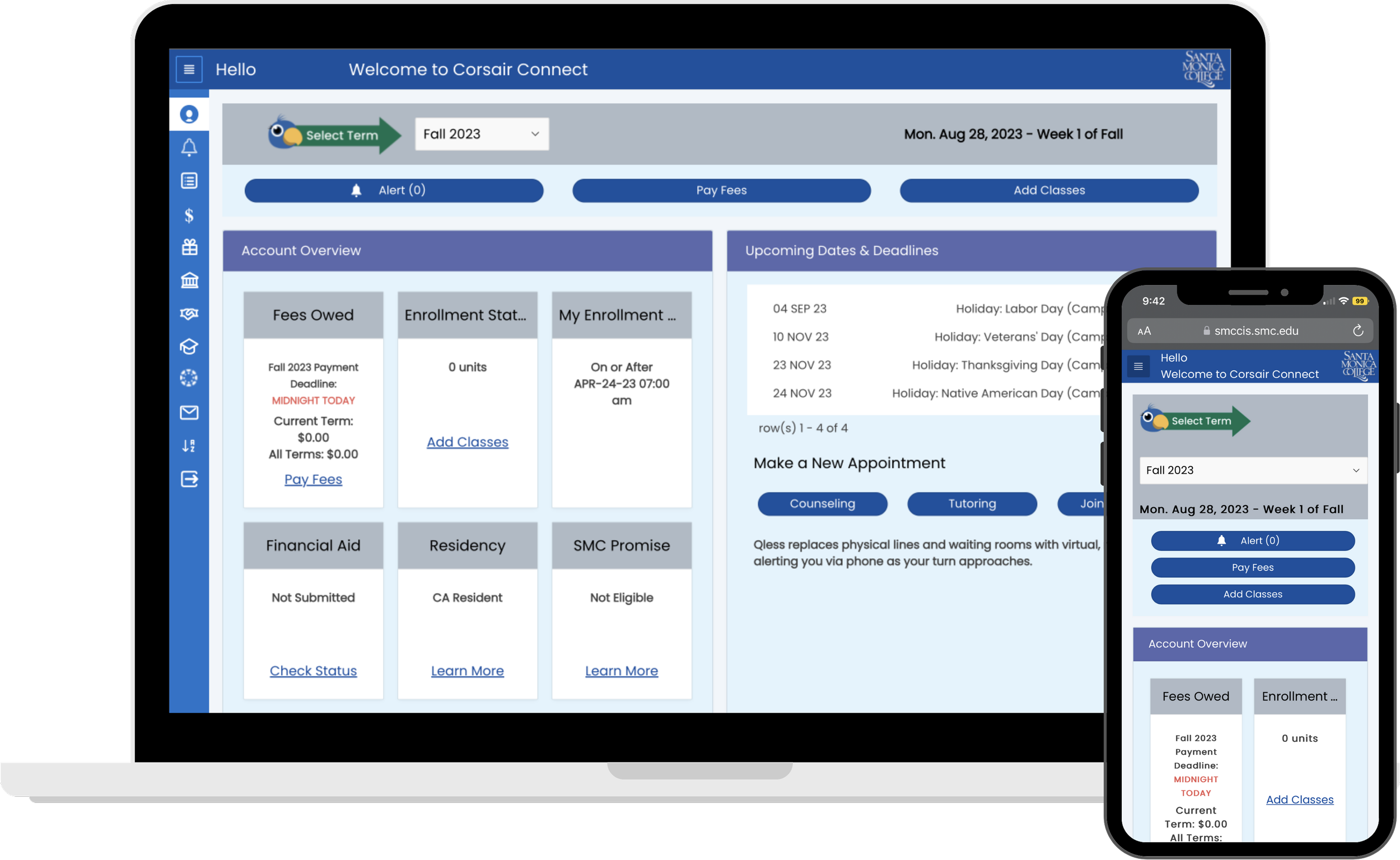
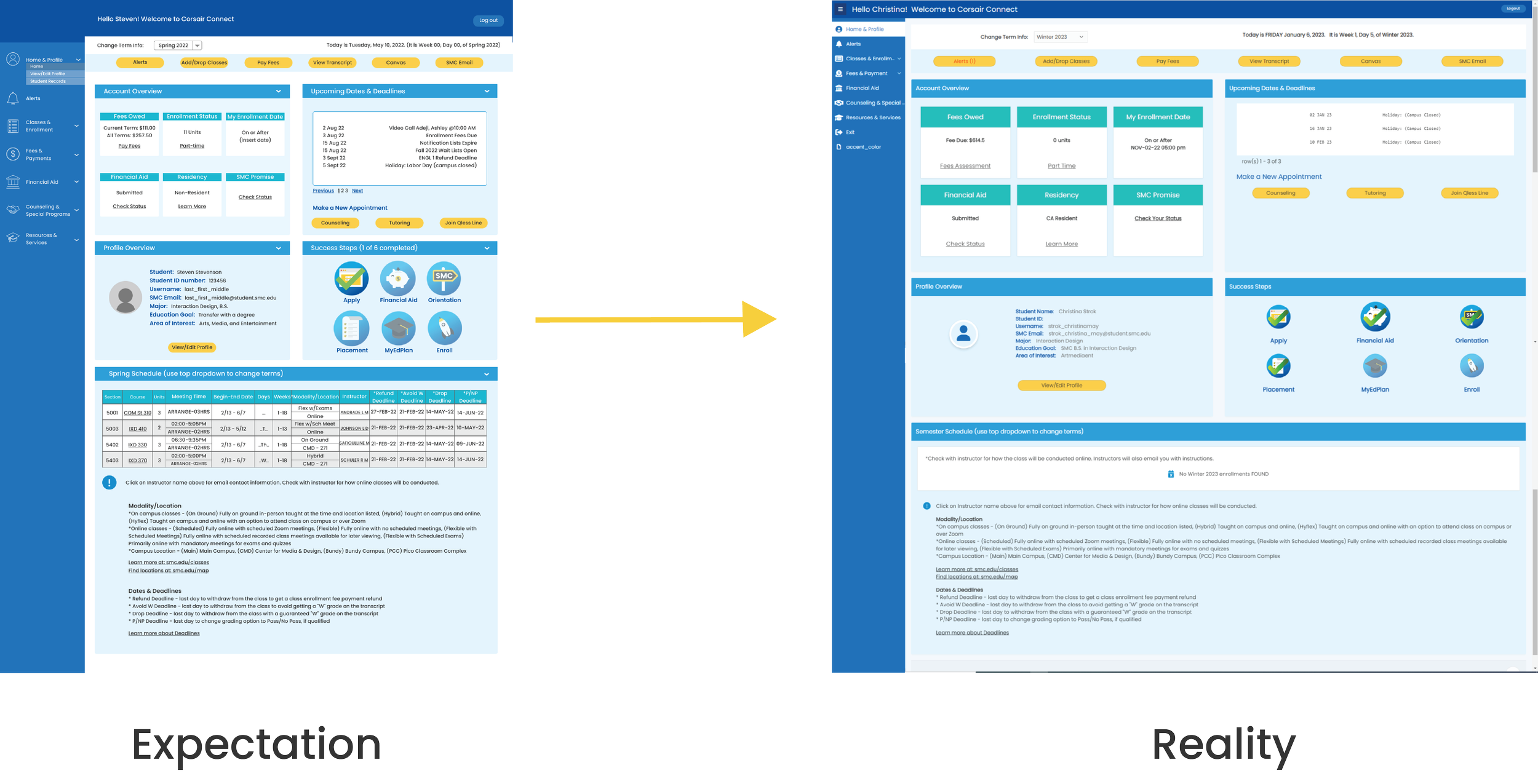
Corsair Connect is Santa Monica College’s student portal for enrollment, financial aid, counseling, and more student services.
This student portal is essential for the college to make money as a business. This is where students enroll and pay for their classes. So it is important to build an experience that produces this outcome while also making the experience better for the student.
-
Outdated
Cluttered and disorganized
A lack of hierarchy and cohesive design
Too many links that take you outside the portal
Lack of personalized experience
Initial Concepts
Initial concepts were provided by UX Research classes at SMC - highlighting features the stakeholders wanted to carry over into the redesign. Based on those concepts and reviewing the research, the goals were:
Modernize the experience
Simplify the navigation
Improve handling of academic business
Personalize the student portal experience
Establish hierarchy and overall design cohesion
Challenge
How can we improve the students’ experience using Corsair Connect while increasing admission enrollment?
Design
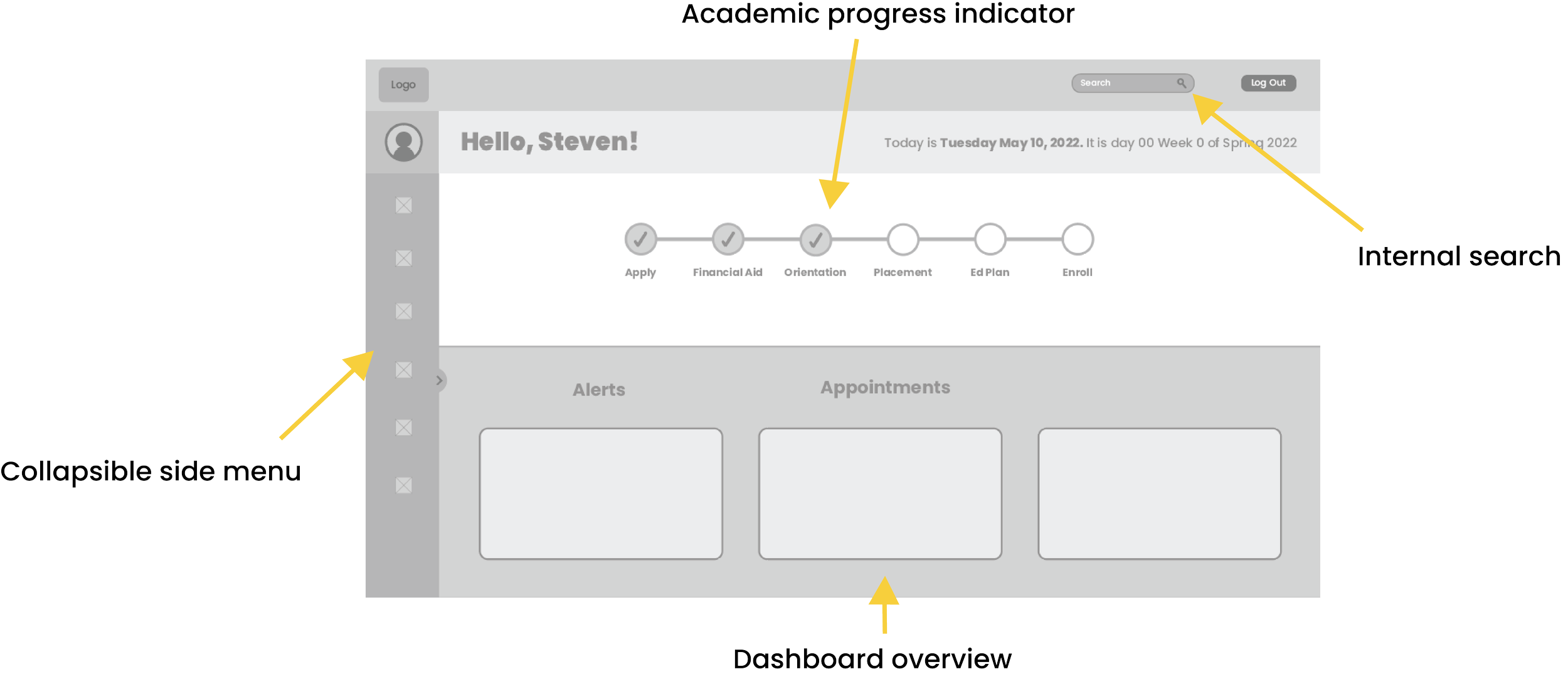
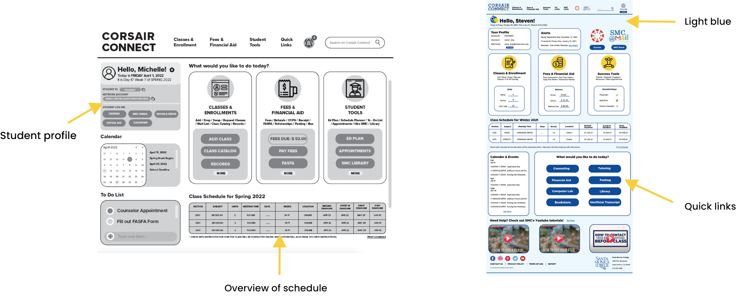
The first wireframes were about deciding on the layout and how information will be presented.
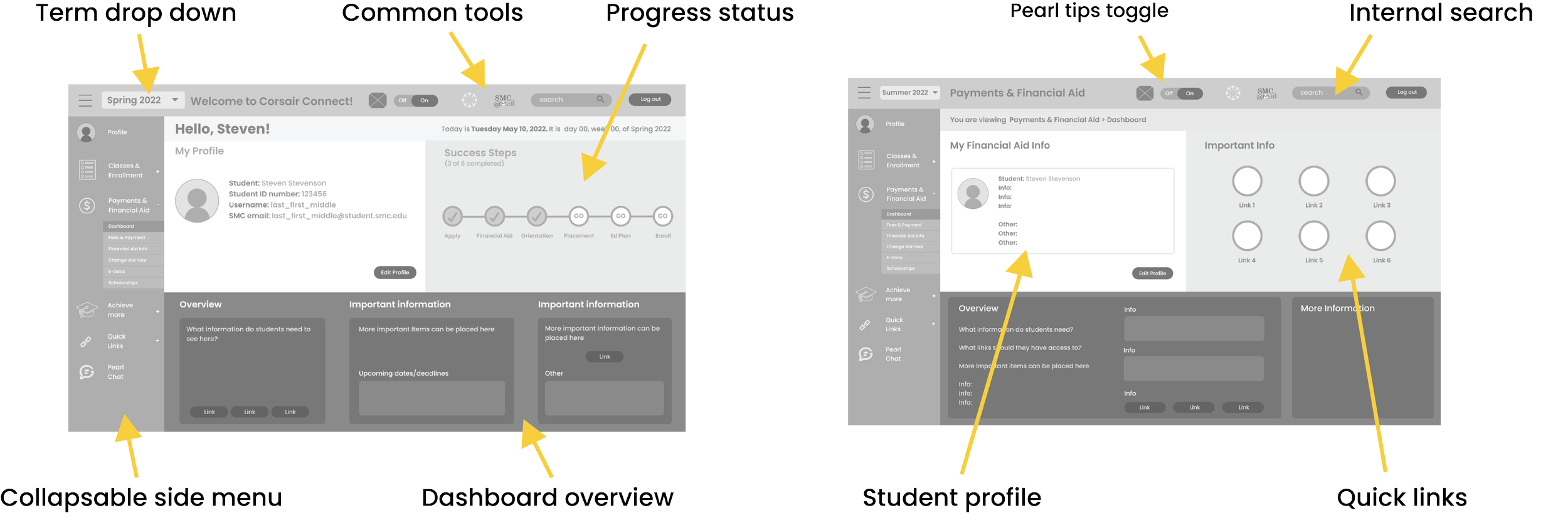
I started implementing the features that were asked to be considered from the concept pitches.
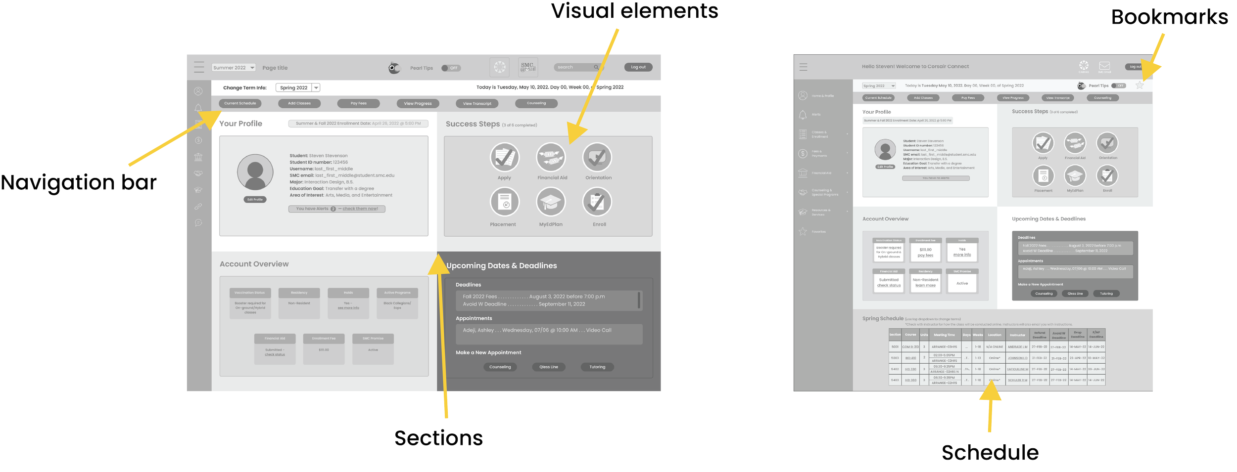
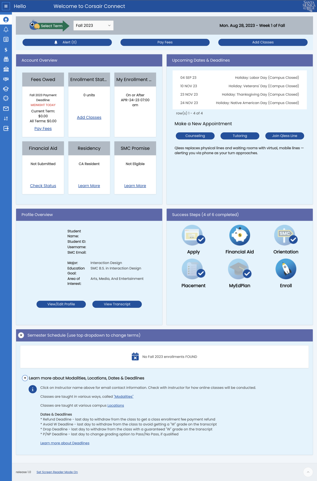
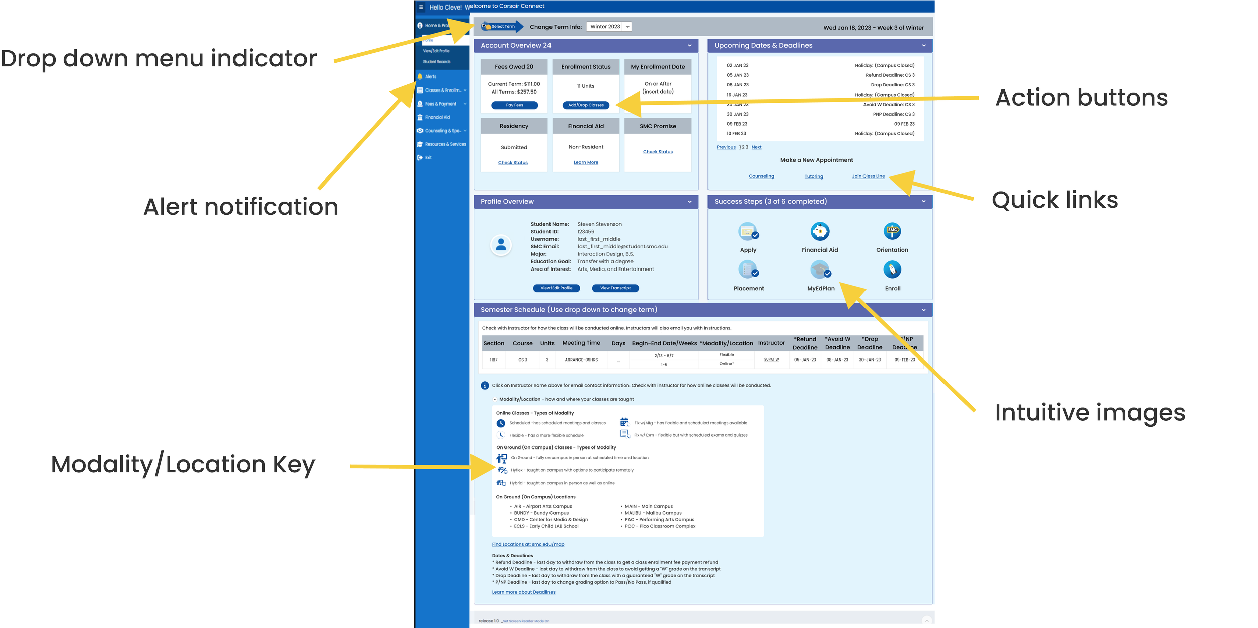
As the layout evolved, navigation improved with buttons for frequently used links or student-requested info. Icons in the Success Steps section could reduce text and gamify tasks by allowing users to check off badges as they complete steps.
To enhance the mobile experience, we moved dashboard info from the bottom to organized sections. Since this redesign doesn’t involve a separate mobile version, it will be responsive.
Color Scheme

Themes
One constraint was the limited color options for main elements. To simplify the process, we used Apex software themes, saving the developers time and aligning with Santa Monica College’s existing portal systems.
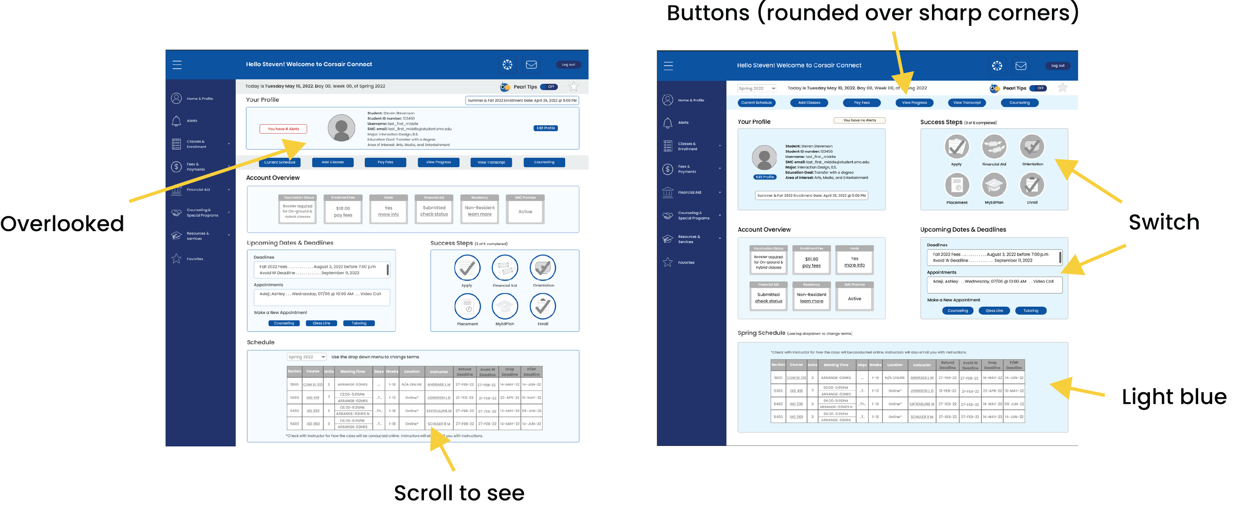
In one meeting, we were undecided on a layout, so I suggested getting student feedback, given they are the focus of the redesign. The PM agreed, and we gathered insights through a focus group.
Based on the feedback and data, we chose the design on the right. This process not only helped us decide but also provided additional insights for the redesign.
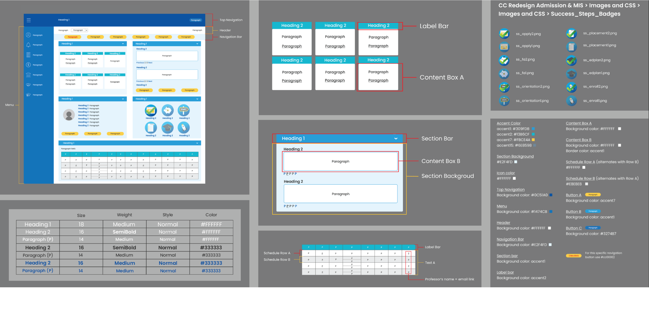
Style Guide + Design System
The initial style guide was created with the college’s branding in mind, incorporating blues and yellow while considering color themes.
After the style guide was created, developers applied the colors and images. I was excited to see the shift from low-fidelity wireframes to the pre-release version with color. This is when I learned the importance of a well-developed design system and entered the testing and iteration phase.

Color Changes
One of the first changes was updating the style guide with WCAG-compliant colors. To address feedback about the design feeling “overwhelming” and “scattered,” we added purple to the blues, creating a calmer, more trustworthy palette for students.
Final Colors
We went with the color scheme that reflected the feedback from the focus groups and surveys. We found that students found the colors to be “relaxing” and “modern”.
Testing
Focus Group
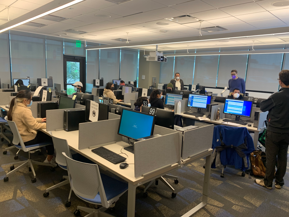
In-person Focus Group
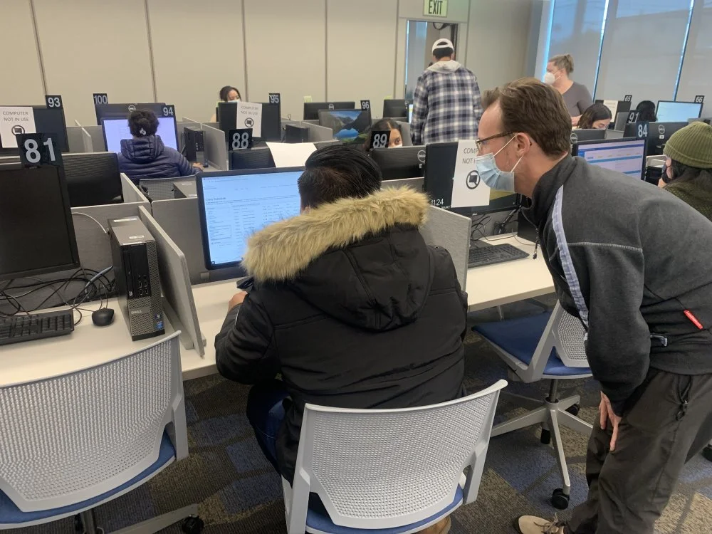
Observations
Survey and Usability Testing Feedback
We conducted usability testing with an in-person focus group of eleven students, receiving validation for achieving our goals of modernization, simplified navigation for efficiency, and a personalized experience. However, we received mixed feedback on the hierarchy, legibility, and color choices.
ADA Compliance
When we evaluated the problem areas with WebAim, we discovered the failure in the contrast checker, which explained the issues with hierarchy, legibility, and color.
Iteration
Feedback Implementation
This iteration addressed the contrast issue to comply with WCAG standards and added an arrow image to highlight the drop-down menu, which some students overlooked.
We reduced and prioritized the quick link buttons based on user feedback about feeling overwhelmed by “too many buttons.”
The Success Steps were updated with more intuitive badges, and icons were added to the Modality/Location section to break up text. This key also appears on Santa Monica College’s website, making it familiar to students.
Iteration
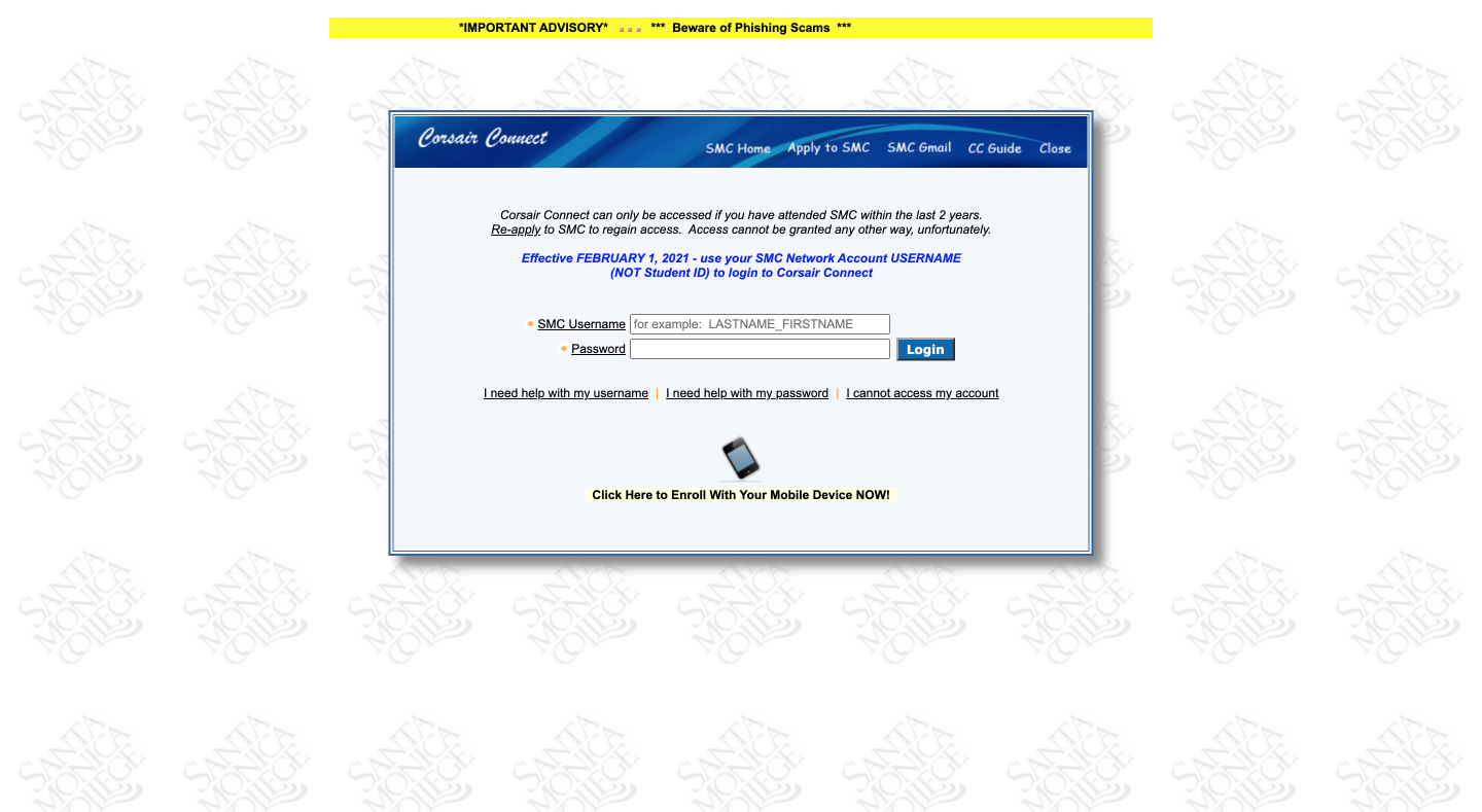
New Features
Previous login page

New login page
Login Page
We wanted to add an image to the background of the login page and chose one that highlights the college's modern and beautiful campus.
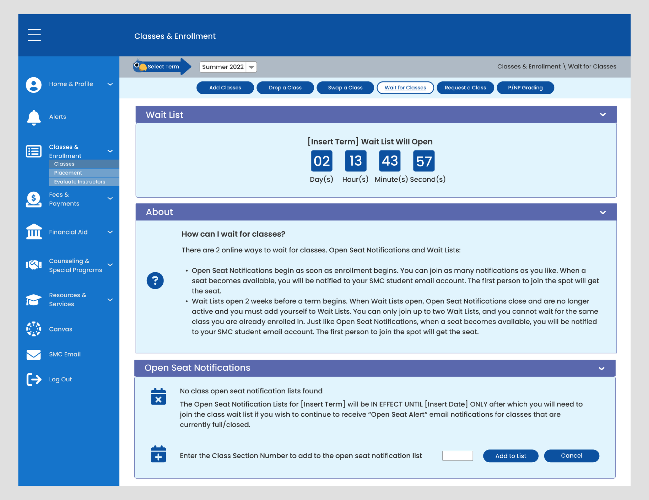
Countdown Timer
Under Classes & Enrollment, on the Wait for Classes page, there is a countdown timer that lets students know when a wait list will open.
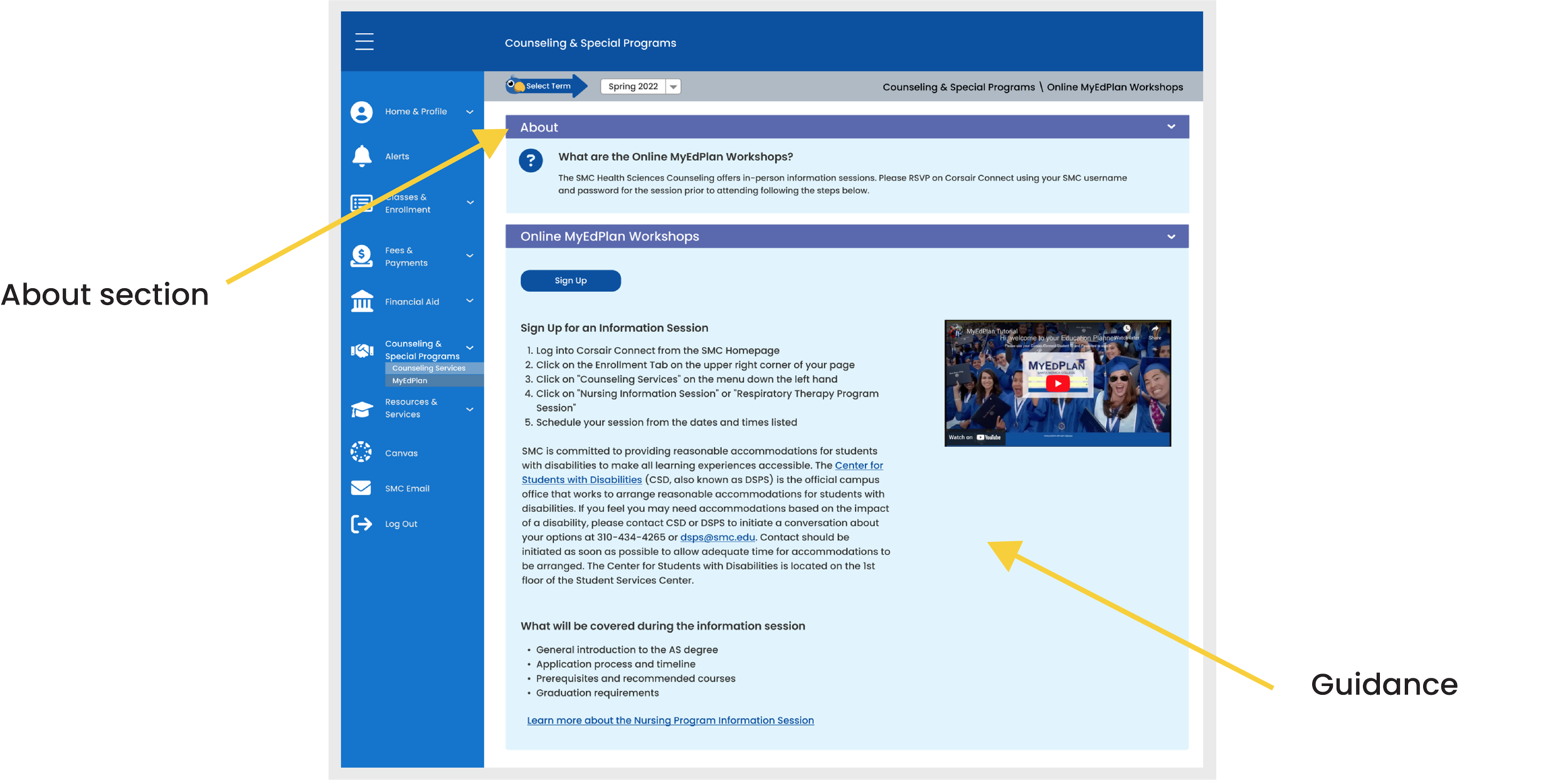
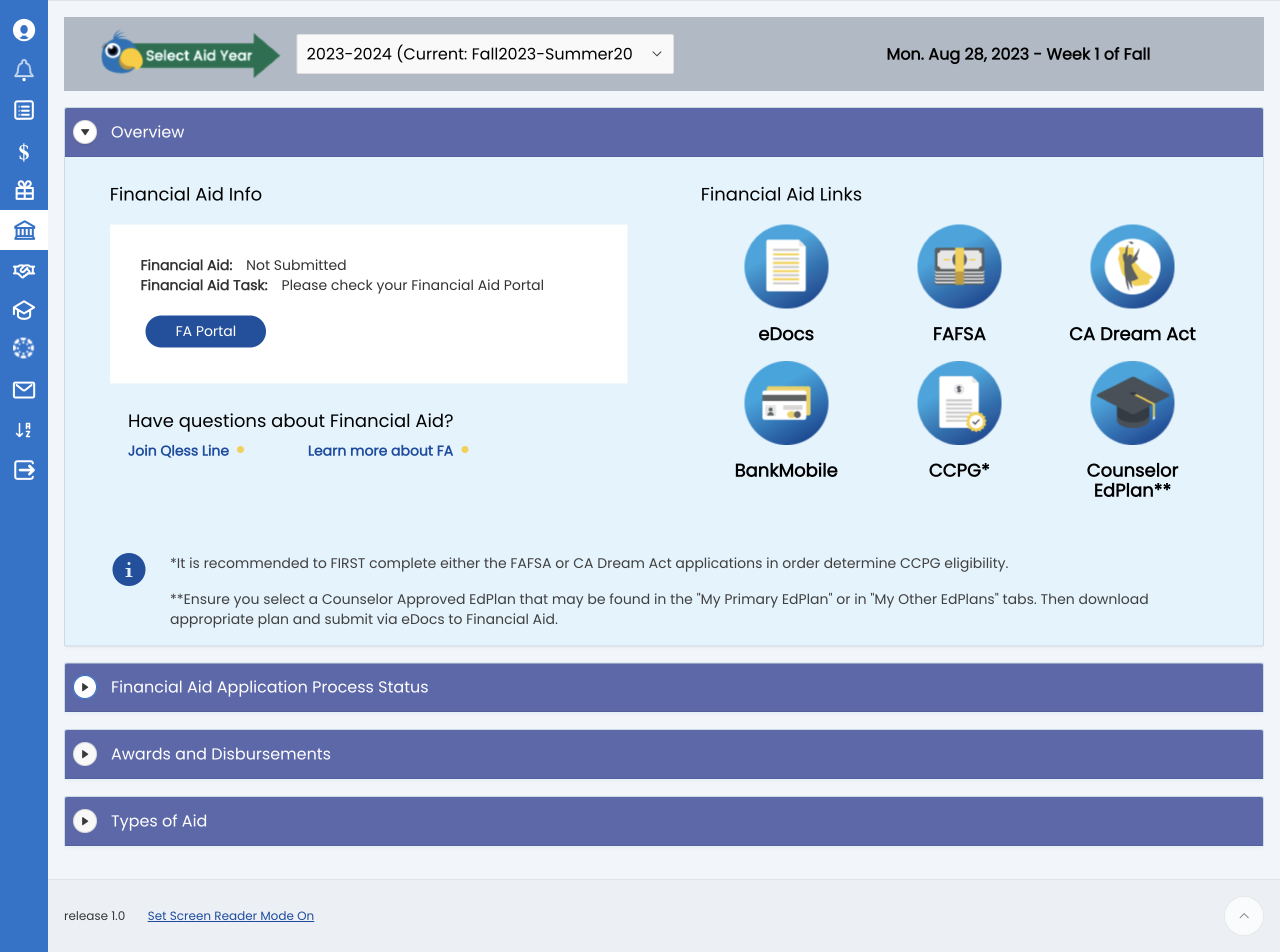
About & Guidance
Another way to help students navigate their college experience is to provide useful information. The “About” sections introduce the pages and further guide users by providing tools for action (e.g., hints, required steps, and video tutorials).

Alerts
A new alert system was created which provides notifications for holds, individual specific alerts, and all student alerts. This page also highlights SMC Go, the college’s mobile app.

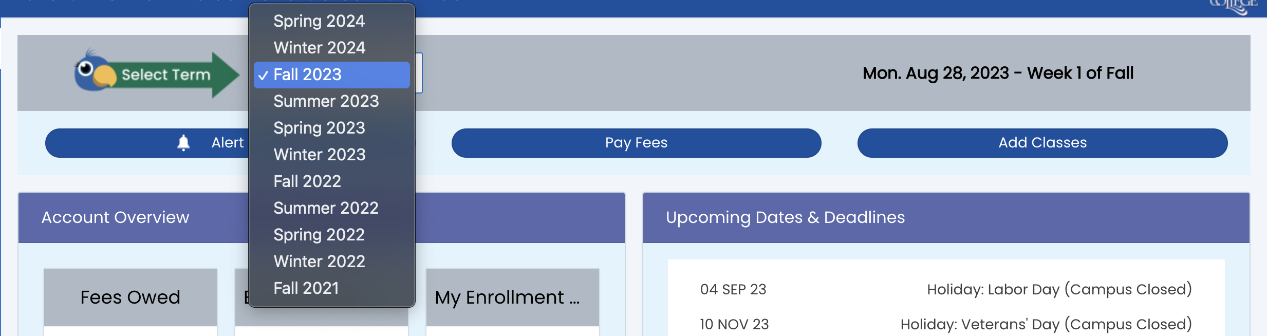
Semester Drop-down Menu
A semester drop-down menu that changes the content to match the semester.

Hovering
Hover State
We aimed to enhance the student experience by adding a starburst hover effect with a color change. This effect, also used on the college’s website, creates a cohesive design and fosters familiarity for students.

Expanded
Collapsed
Accordions
To reduce information overload, we created accordion menu bars, improving mobile user experience by minimizing scrolling. Students are already familiar with this feature from Canvas, a platform for accessing class content.

Emeritus Program
After receiving feedback from a focus group with students in the Emeritus Program, we designed a custom experience that pertains to these particular students, so they can access information that is relevant to their program.
Takeaways
I gained experience working with cross-functional teams in the higher education sector, including the Project Manager, Dean of Enrollment Services, Admissions & Records, Financial Aid, Counseling departments, student workers, and the MIS team (engineers), all focused on improving the student experience.
This redesign allowed me to participate in the product's journey from concept to launch, deepening my understanding of the design strategy through student and staff feedback.
I learned the importance of following WCAG standards from the start and aim to help businesses achieve their goals by understanding their challenges and focusing on the needs of their users.